Wednesday, November 2, 2016

Don't Judge Me...

I just have to share this Steven Burton's work...
Here is BOOOOOOOM's explanation:

In “Skin Deep” photographer Steven Burton digitally removes the tattoos of ex-gang members, creating dramatic before-and-after style portraits that offer many subjects a glimpse of themselves they haven’t seen for decades. Not only do the images elicit strong emotional responses and personal reflections, the transformative series raises broader questions about social stigma and how we perceive others.

While I am not sure my middle schoolers are ready for this conversation (at least not this early in the year), I think the concept is so powerful. Even those of us who think we are open minded and don't judge people can't help but question ourself when we see these photos side by side. 

Friday, October 28, 2016

Wednesday's Digital Art Class

My 6th grade students get an extra quarter of art every year. I work to make the focus be on creating digital art. My students love it and I love that our only set up is handing out iPads (art teachers who paint, clay, collage, etc during the rest of the week understand).

We started with VALUE LANDSCAPES where students learn how to use drawing pad and create a landscape with changing values to show space.

Then we moved onto LINE PORTRAITS where students reviewed the facial rules and contour line while drawing a self portrait. 
For a fun break, our next project was using FriendBlender to recreate a famous artwork with my students' faces. They had to research the artist and artwork so they could write a quality artist statement. This is one of my favorite projects for them to do. 

Our 4th project was a review of STILL LIVES with a focus on colors and blending. They were still working with drawing pad and their skills were improving. 

After we finished our still lives we reviewed how important our use of colors can be. Therefore, we created a COLOR WHEEL using the app TypeDrawing. The kids had a really fun time reviewing the color wheel with this fun app. 

As students finished their color wheel we discussed how the images were balanced. Did they use radial, symmetrical or asymmetrical balance. We then finished the quarter by creating radial designs that use their names to create the image. 

All in all, it was a fun quarter of art projects that lead to a lot of great discussions how easy doesn't always equal quality. It was also a really great way to review a lot of vocabulary we have covered in 5th grade (and before). 


Thursday, October 27, 2016

Celebrating Creativity 2016


Every year we make the trek (that is what you call riding a bus for 2+ hours both ways) to Omaha for Celebrating Creativity at the Joslyn Art Museum. You can read about more trips here.

This year was another WONDERFUL experience.
 Students started the morning with 3 sessions. A tour of an specific gallery. I tagged along for the Dirt Meridian show. It was inspiring. This show focused on the photographs taken by Andrew Moore as he traveled along the 100th Meridian. These large print digital photographs were breathtaking. The docents led the students through some writing activities. I was so proud of the short poems my students wrote.
They also attended 2 different sessions. One of the students favorites is always the theatre makeup. Can you believe this was made with chocolate and strawberry sauce? Today's creepiest one was done on a students bald head. I swear it looked real from across the room.
Speaking of chocolate sauce... one of the sessions I stepped into was making prints with your food. Students were using photo paper and food of different consistencies to make these prints. The whole room smelled like a chefs kitchen and the kids were having so much fun! I wish I could have done this session! 
Outside of the classrooms there were some really, really intriguing weavings. I had to snap a couple of these student made projects. These were created by students in the Joslyn's art programs. They were beautiful and inspiring. 
 
 After the stimulating morning I had to recharge with a total foodie moment. The Durham Cafe always has the best food. Today's tomato bisques and greek salad didn't disappoint (and totally beat a typical school lunch).
The day concluded with a ANOTHER WONDERFUL presentation by the Omaha Symphony. Every year they amaze me by how they tie art and music together. Today they focused on the importance of appreciating the history of art and music. How being an active participant in music and art makes the experience so much more. 

Until next year... we will be back! 


Monday, October 24, 2016

Ken Shelton

As I mentioned in my last post, Kenneth Shelton was the keynote speaker at our Nebraska Art Teachers Conference and he was awesome. You can find out more about him on his blog, on twitter or on instagram but here are some things that stuck with me.


His first presentation with iPhone/Droid photography. It was such a fun session that really made us think about the "story telling device" that is our (and our students) digital device. Here are my takeaways from that presentation.

  1. You should MAKE photos, not TAKE photos. Taking 20 snaps and hoping one turns out is taking photos. Looking and composing an image is "making" photos.
  2. Don't worry about capturing EVERYTHING, just capture the RIGHT thing.
  3. Enhancement is perfecting your images while manipulation is changing your image. It is okay to do both when you are capturing the things that matter in a way that tells the story.
  4. Challenge students to make photos with a theme (ex: location, time, character, story, face in place, abstract, symmetry, texture, lines, etc...)
  5. He shared some of his favorite apps and they were: photoshop, snapseed, lightroom, procreate, google nik collection, golden light. He recommends having more than one and using them often.
  6. Here are some of my photos from this session.  Can you guess which one was lines, texture, symmetry and perspective.
On Saturday I was able to take a second session that focused on the power of voice in the digital age.  This was a really engaging and thought provoking session. I think I took 2 pages of notes... and that was writing as fast as I could. Here are some of my take aways.
  1. Are you asking your students "google-able" questions or questions that make them think?
  2. It's not a digital footprint, its a digital tattoo. - just think of all the screen shots that exist of tweets and posts that have been deleted. There will always be a faint trace of your past online.
  3. Share your communities STORY... and make sure you are the curating the story. You can use visual storytelling (a single image), digital storytelling (gifs or moving photos) or cinematic narrative (a moving video).
  4. Publish your story - If you don't share what you are doing, someone else might and you might not like what they say. 
This video is impressive but doesn't have a story

This video has a story...
Notice the difference?

Make sure you are telling your STORY. Help you students tell THEIR STORIES.


Thursday, October 13, 2016

NATA 2016

2 weeks ago I was able to attend that Nebraska Art Teacher Associations Fall conference in McCook, NE. It was such a wonderful time.

#1 The landscape is ABSOLUTELY beautiful...


#2 The Community of McCook is a hidden gem. They are a progressive small town who values the arts (and I think their art teacher Deb Goodenberger is a huge reason why). They also have the only Frank Lloyd Wright house in Nebraska with the Sutton House. We were able to tour it and wow! While I might not have agreed with everything FLW did, he sure can design a house. 
The history of the house is shared with every 5th grader as Mrs. Goodenberger has them tour it every year, even though it is a private residence. It has been a house, an apartment building, a doctor clinic and then fully restored to a private home. You can read more here or here

#3 The Keynote was AMAZING! Kenneth Shelton was so good. It was a small group of us and he really connected with everyone and shared his wealth knowledge. I will be doing another post about him as there is too much to share right here.

#4 The state of Nebraska has some really great art teachers in leadership roles and they work really hard to promote the arts and art education in the state. From Deb Goodenberger who organized the event to our Co-Presidents and past presidents. Everyone there was advocating for power of art education. It is always challenging to give up classroom/weekend time to attend conferences but after spending 2 days surrounded by your peers you are rejuvenated and ready to rock.

#5 And then this happened. I was honored as the Nebraska Middle Level Art Teacher of the year.
It is such an honor. I don't really have any way to explain how much it means. 


Wednesday, October 12, 2016

Pumpkin Spice

I am on our school's social committee and this year we are trying to "shake things up" a bit. 


Our first attempt was to sponsor a pumpkin spice challenge. Staff was asked to bring in their favorite pumpkin spice recipe. Judging went down at 9 am.


We definitely had a hard time choosing. Very yummy stuff all around. 


Most Creative Use of Pumpkin went to Mrs. Abler who made an amazing Pumpkin Butter! It was so yummy on crackers with whip cream. 


1st Place went to ME! I made pumpkin cheesecake struesel bars for fun but ended up victorious. 
(I didn't not vote, just sat in on the tasting)


2nd Place went to Miss. Riese and her yummy Pumpkin Pie Muffins. They had these amazing little cinnamon chips in them - Yumm! 

It was a lot of fun to do something new... especially on a cold, wet fall day! 


Monday, October 10, 2016

Get You Thinking Share #4

As a mom of two little girls this article really got to me. After reading it I couldn't help but think of the relationships of the girls in my classroom. It breaks my heart that girls go through so much. 
It's easy to think, "I made it through this junk when I was a kid and so will they." The truth is we all carry scars from this time in our life. Understanding that and having some compassion can go a long way! 

I was also excited to see these articles posted at the bottom of the page. I think this might be a site worth saving. 

Thursday, September 22, 2016

Right Brain vs. Left Brain

As art teachers we know the struggle of the left brain vs. the right brain.
photo credit
In 6th grade I feel my students really start to change into I can't draw, I am worried about what others think, preteens. Therefore we spend a lot of time talking about our brains in 6th grade. We talk about how the left side of our brain often gets more "time on task" while our right brain is better at art stuff. We do lots with our brains in 6th grade... and so to start the year I had them create left and right brain drawings.

They started by drawing one thing they love right in the middle of their folder cover. Instead of a brain we illustrated the saying "they have ________ on the brain." Then they add things to the left side of their image that shows how THEIR left brain works. They finished by adding things to the right side of their drawing that shows how the right side of THEIR brain works.
We talk about how playing football is both... memorizing the x's and o's of the plays is left side of the brain while enjoying the act of playing is a right side of the brain activity. We talk about how the measuring and following a recipe when baking is a left side of the brain activity while choosing the colors and frosting are a right brain activity. It really is fun to listen to the kids as they discuss how the activities they enjoy use both sides of their brain.
To finish the assignment they colored the image and handed in some really neat images.  You can check out more of them over at our artsonia site.

Monday, September 19, 2016

Elements of Art Cubes...

Every year our 5th graders study/review the elements of art throughout the year. Therefore, when we start 6th grade I like to have them do a quick review lesson. This year we created element of art review cubes. (you can read more about them here)
Students created an element of art cube illustrating Line, Shape, Color, Texture, Space and Value on each side. (we left form off because we were building a form)  When they were put together, we made this "Elements are the building blocks of art" display.
** Yes, stacking student built blocks did test my Jenga skills**

Monday, September 12, 2016

Get You Thinking Share #3

We are doing all kinds of things in the art room already this year and I can't wait to share with you but nothing is DONE yet. You can see our "in progress" work by following me on twitter @carlisleartclas and stay tuned for updates. Until then I will share another great Friday Share article.

Business Insider published this article showcasing the importance of creativity. They also shared 7 steps to help EVERYONE be more creative. Even as an art teacher I found myself thinking, "I should do that."


A great big thank you to my principal for sharing this one with all of us. 

Tuesday, September 6, 2016

Get You Thinking Share #2

This article...


I read this article by Victoria Prooday and it definitely left me thinking... It was even an article that had me reading the comments (Which is not always an enjoyable thing. Why do people have to be so mean)  It is interesting to say the least. What do you think?

Friday, August 26, 2016

Get You Thinking Share #1

One of the things I am challenging myself to this year is sharing more on my blog. It might be sharing the who, what, why and how of what is happening in the art room but also sharing those things that just make me say, "YES, that is awesome."

My first share is an article written by Elena Aguilar for the website Edutopia to inspire first year teachers... but that I think us "veteran" teachers can remember as important also. If you have a minute, browse this list.


Wednesday, August 24, 2016

Time is flying...

School is up and going and I am not going to neglect this area this year.

There are some changes coming so stay tuned....

Thursday, May 19, 2016

Wednesday, May 4, 2016

Lego People...

I needed an "extra grade" for some of my classes. I decided to challenge them to design their own Lego person. This was something they could do completely on their own time. It would tell me more about them and help them earn an "extra grade."

There are some pretty creative students at NMS!

I am thinking I am going to have this to my sub plan for future use! 


Tuesday, May 3, 2016

Animations

My Wednesday art classes have been finishing up a lesson on Animation. It has been so much fun seeing all the different ideas.

Here are few of my favorites:

Taste the rainbow!

The Life and Times of Bill

Fish Fight Smackdown 
(no one was harmed and the "slap fight" made me laugh out loud)

Color Mixing!

There are more that you can check out at CarlisleArt on YouTube

I think they are pretty darn good for first time animations! 


Wednesday, April 27, 2016

Radial Balance, Different Ways!

One of my favorite projects this year had my students creating 18x18 radial designs. They were BEAUTIFUL! 
I gave the challenge and then they could select from oil pastel, tempera paint or colored pencils to complete their image. They could also choose warm colors, cool colors, color wheel order or monochromatic color scheme. The variety and beauty was amazing. 
color wheel order with oil pastels

monochromatic "batik" with oil pastel
 
cool colors with tempera paint

complimentary colors with oil pastel

You can check out more at our Artsonia site.

A while later we had one of those 20 minute class periods that EVERY art teacher loves. 
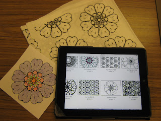
We used it as an opportunity to review radial balance. Students used the app Amaziograph to create radially balance "coloring pages." We uploaded them to artsonia and students can print them off to color them. 

I also took this as an opportunity to try out a website I had heard about. Spoonflower is a fabric site but I heard they did a really neat job of printing fabric you design. I downloaded a few of my students designs and gave it a shot. I was really impressed. 
Ashytn's design on artsonia, 
printed out and colored and 
printed by Spoonflower on fabric!

Here is a colored version...
The color is pretty intense and I am going to see how it washes up but I am very impressed. 
Thank you Spoonflower for helping my students take their art work to another level.